New brand design: From the name to the Corporate Design
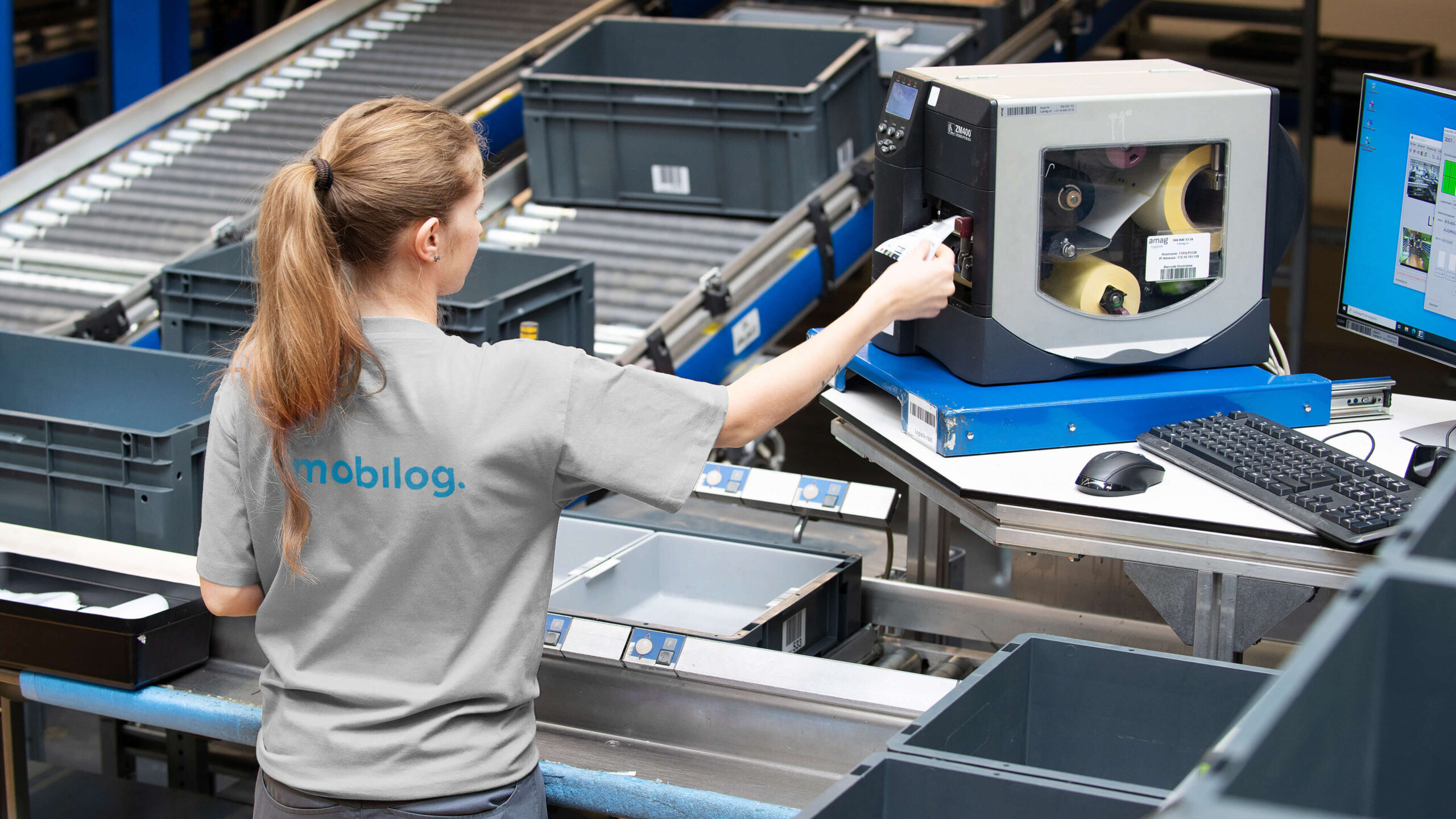
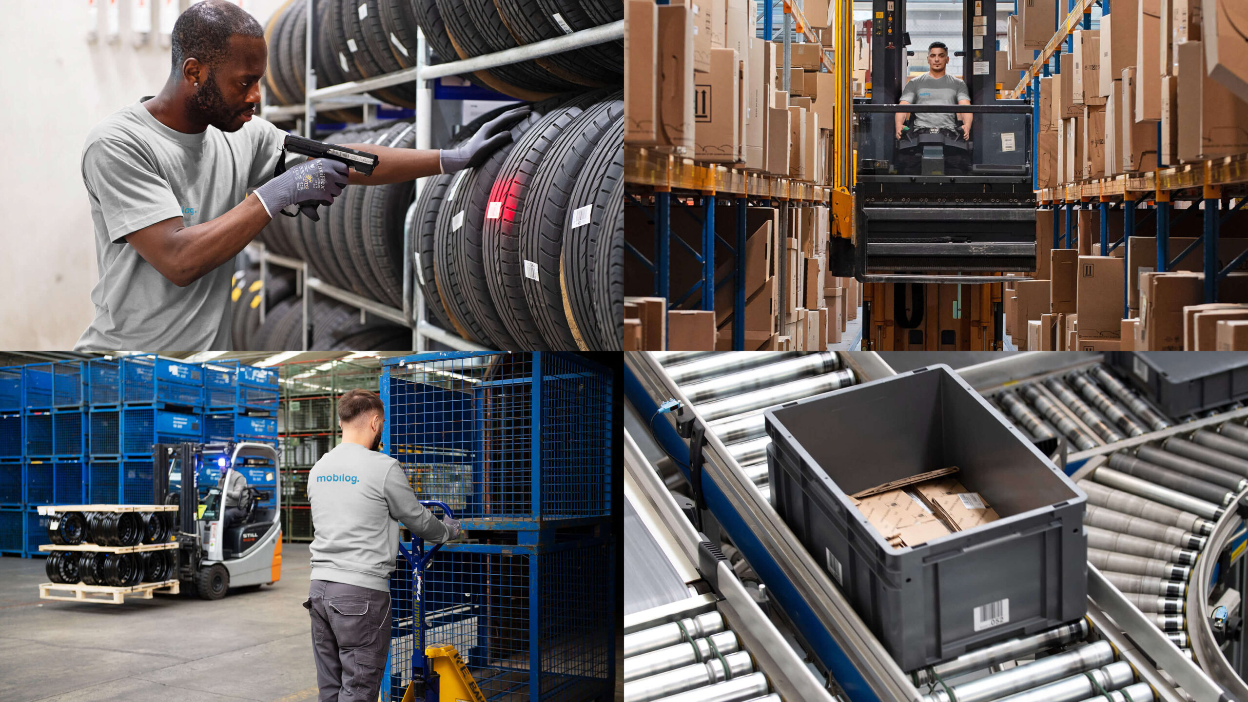
mobilog AG was founded as part of the AMAG Group 2021 to meet the growing demand for high-performance logistics in the automotive sector. The wide variety of models and product ranges and the increasing service requirements of customers are a constant challenge for car dealers and workshops. As a competence center for all logistics activities in the vehicle and parts business, mobilog is a strong, comprehensive partner.
Fresh design with strong symbolic recognition feature
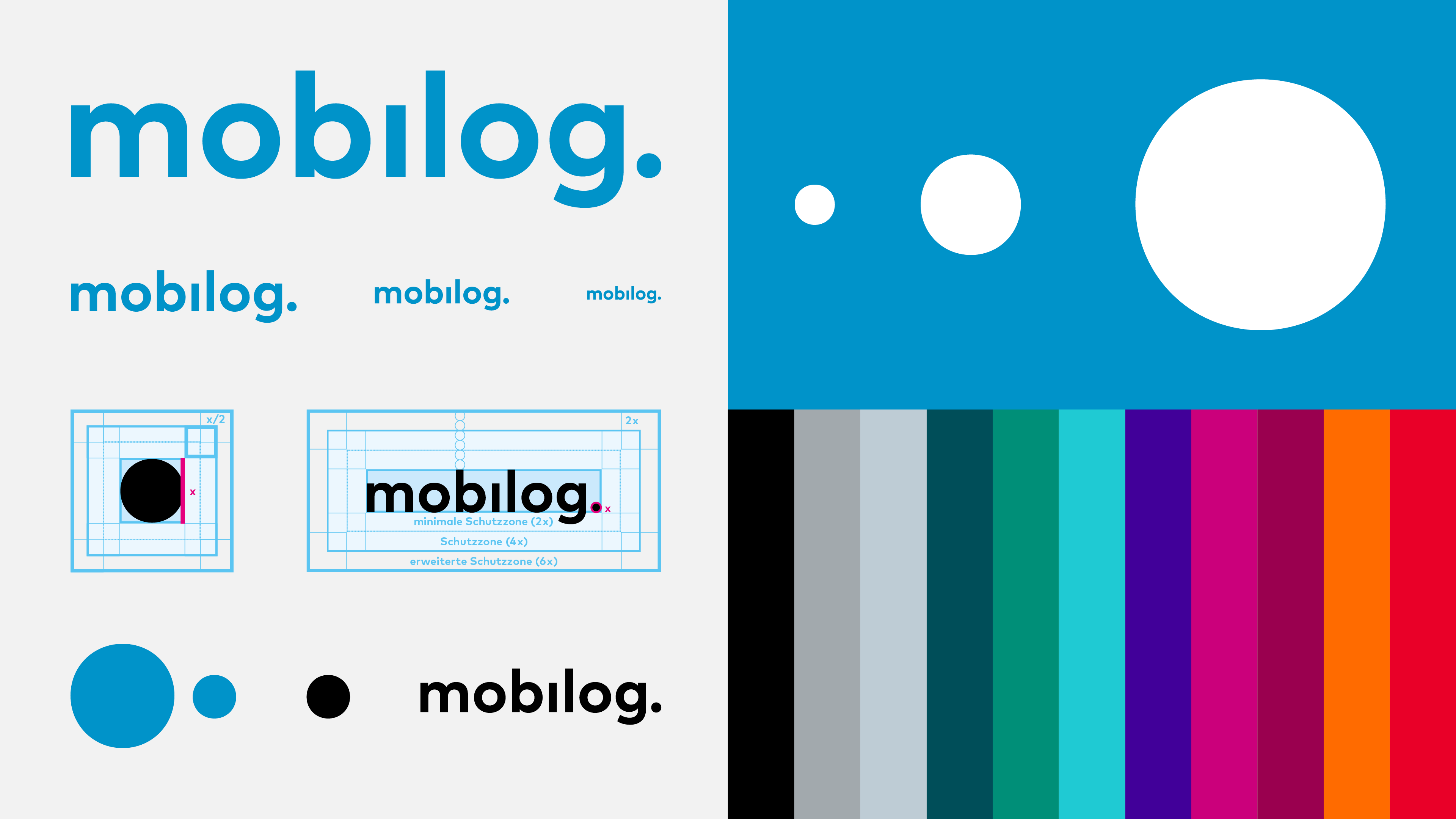
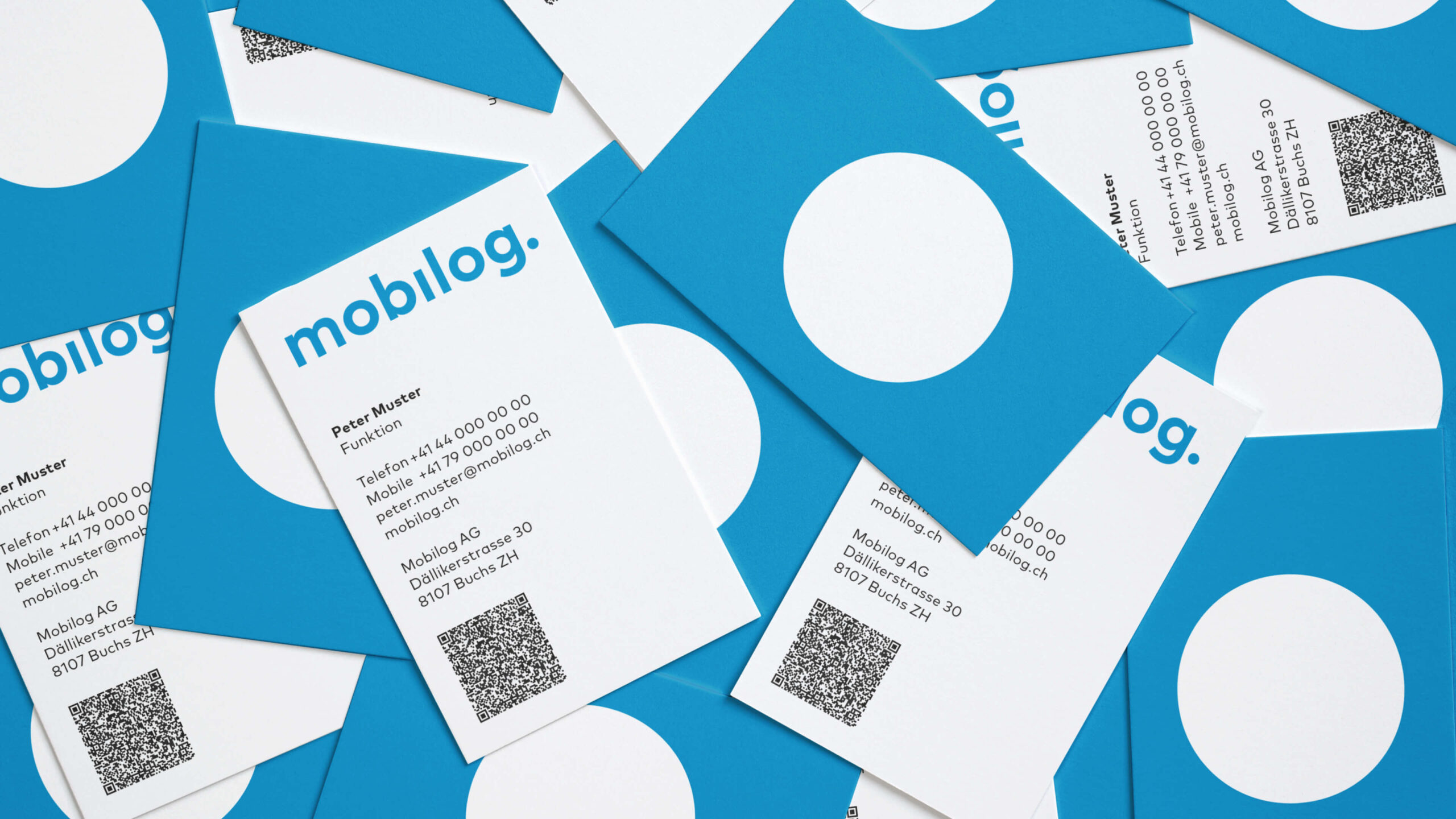
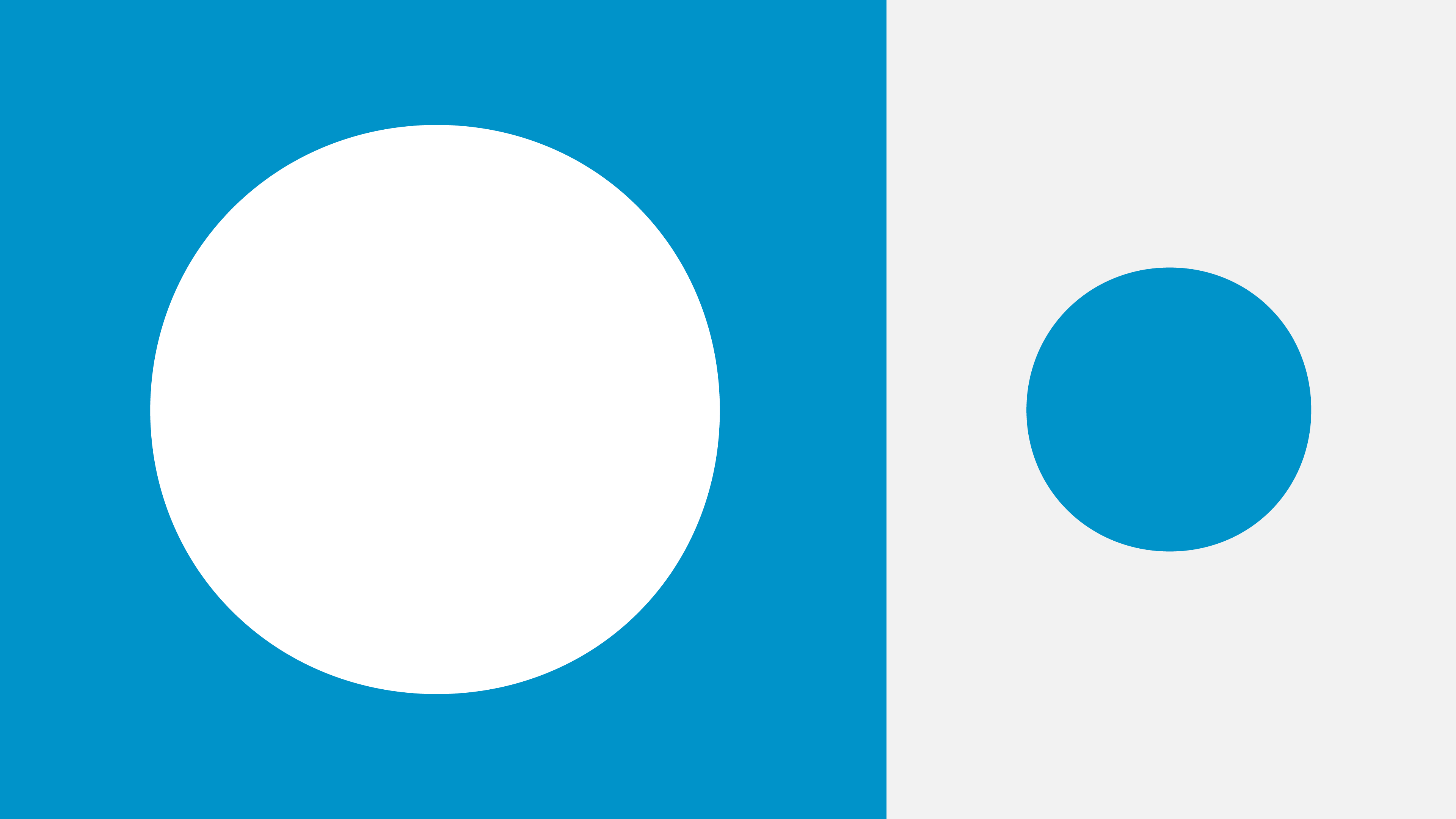
When the company was founded, Heads was asked to come up with a name for it. mobilog stands for the combination of mobility and logistics. Heads’ task was to create a design for mobilog AG that would make the company more independent and make it clear that the logistics service provider is available to the entire industry as a competent partner. mobilog moves Switzerland – this is symbolically expressed in the new logo by moving the “i-dot” (the ball). This ball is a strong recognition feature throughout the brand’s new look. In addition, the main color, a deep sky blue, contrasts with the white to create a concise design language.
— Analysis / Brand Design / Experience Design