Independence in the market environment
Because of the brand identity defined with Heads, Heyde decides to also revise its appearance accordingly and commissions Heads with a consistent implementation of the strategic orientation in the corporate design and the design and restructuring of the website.
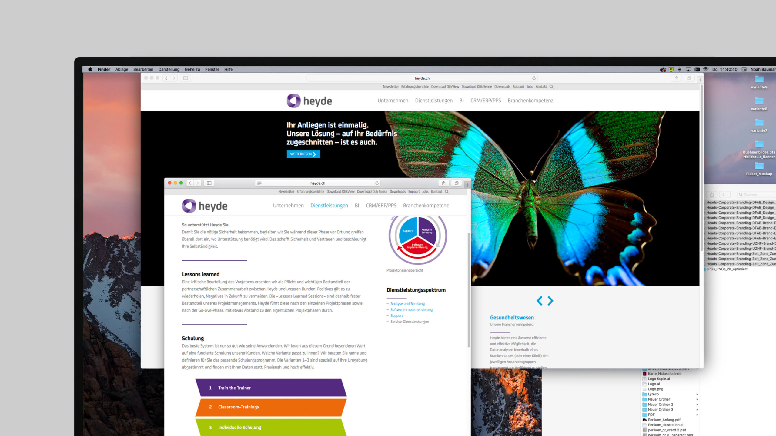
Appearance underlines brand identity
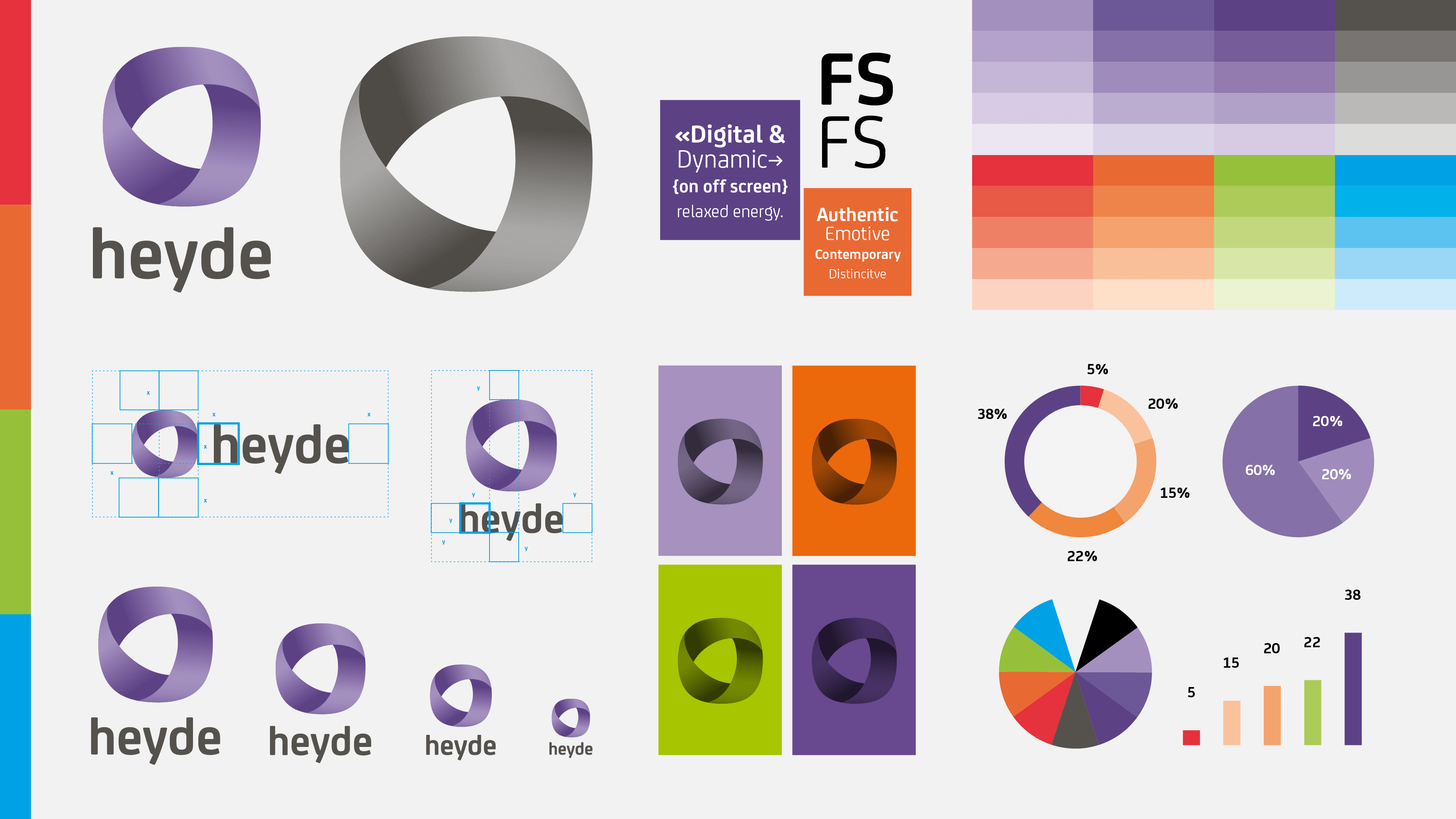
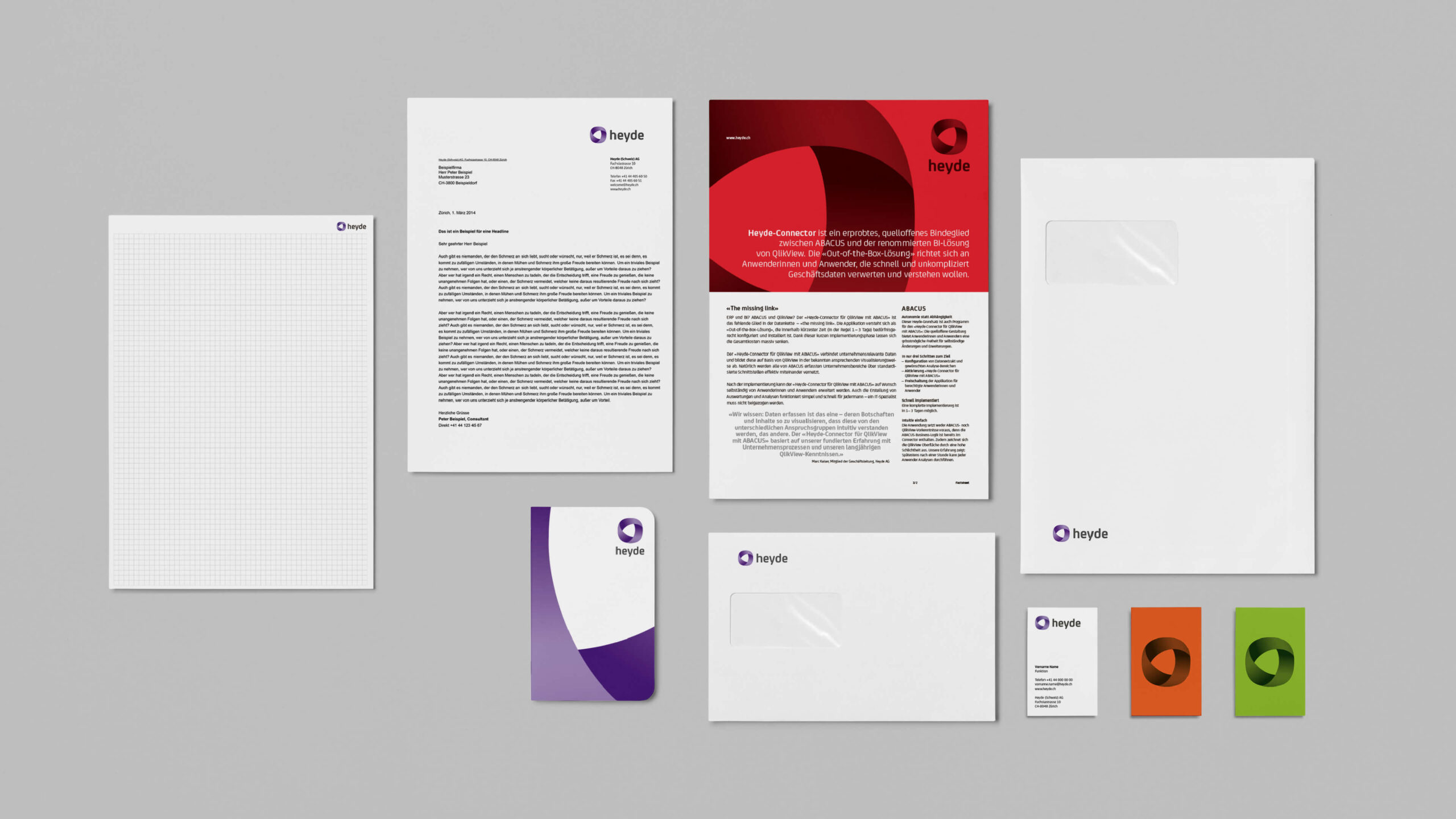
A figurative sign symbolizing the close partnership in consulting services becomes part of the new logo and underlines the individuality and creativity of a cooperative partnership through the violet color scheme. An independent typeface creates clear recognition, and bright color accents become an expression of the endeavor for customer-specific solutions. Instead of showing satisfied customers as before, Heyde now expresses the uniqueness of customer concerns in its images. The generosity that belongs to the new appearance is also conveyed by the homepage of the website. The revision of the information architecture also ensures the best possible user experience.
Great attention for the new appearance
The new design attracts great, positive attention in Heyde’s environment and gives the company an enormous independence in the market environment. Heyde, previously considered rather inconspicuous by the company itself, is now perceived as much more self-confident. Also, on the website Heyde appears in a sovereign manner and offers the user in-depth information about the company and service areas. Users can easily find their way around and quickly access all content.
— Brand Design / Brand Experience